
Hi everyone! Hope you all had a great week. This week was “redesign week”. Coincidental or not, major networks decided that this week was just as good as any to announce “major” updates on design, usability and more. So where should we start? Not really important, so let’s see what’s new this week.
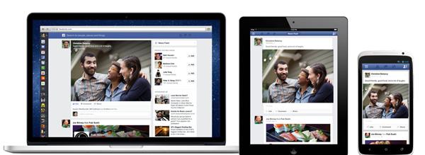
FaceBook – Announced a new version of Facebook designed to reduce clutter and focus more on stories from the people you care about. You see all the stories you saw in your News Feed before, but with a fresh new look. This new design will roll out slowly and if you want to be one of the early adopters, go to http://www.facebook.com/newsfeed and add yourself on the waiting list.
We’ve completely rebuilt each story to be much more vibrant and colorful and highlight the content that your friends are sharing. Photos, news articles, maps and events all look brighter and more beautiful…. Also, Facebook will now have the same look and feel on mobile, tablet and web.
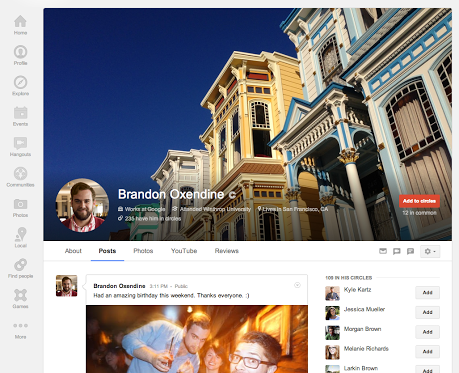
Google+ – Lots of changes too. Sara McKinley mentioned that a much bigger area for your profile cover photos and several page improvements are gradually rolling out (see below).

Some profile & page improvements, per your request
We spend lots of time listening to your feedback, and today we’re launching some profile and page updates that you’ve been asking for. These include:
– A new tab for your Local reviews. In addition to your photos, +1’s and YouTube videos, there’s now a place for all your Local reviews. Highlight your favorite restaurants, or hide the tab completely via settings — it’s completely up to you.
– An easier way to edit your info. The ‘About’ tab now consists of separate cards (like Story, Places, and Links) — each with its own prominent edit link. As always: you can share specific fields with specific circles, or keep them just for you.
– Bigger cover photos, with a better aspect ratio. Cover photos are much larger than before (up to 2120px by 1192px), and they display in 16×9 when fully expanded. This way more images can be used as cover photos, and there’s more room for your selection to shine.
Everything’s rolling out gradually, so check back soon if you don’t see it yet. Once it’s live (at plus.google.com/me), let us know your thoughts in the comments!
#googleplusupdate
YouTube – Of course YouTube could not be left behind and this week they announced the so called “YouTube One Channel”. According to YouTube this will allow users the ability to put up a big header on the top of their channels and to have a video trailer (sort of a welcome video) which starts playing for all visitors who aren’t yet subscribed to the channel. This one is actually cool. Have you created your “welcome” to my channel video yet? I’m working on it… Anyway, if you want to start with your new channel layout, just go to go to https://www.youtube.com/onechannel and upgrade.
Like I said, major redesigns and improvements. And Oh, in case you missed it, Pinterest (not this week), also changed a bit their design.
How about you? Did you make your changes yet on G+ and Youtube? Can you see FaceBook’s new news feed already? Do you even like the changes? Interestingly YouTube’s video presentation about “One Channel” has 4x more dislikes than likes. Wonder if that is a “general” feeling?
As usual, in no particular order:
SEO/Search/Marketing
- 10 Types of Links that Really Matter and How to Get them
- How to Write a Press Release That Gets Noticed
- On-Page SEO: Past, Present & Future
- Did Google Just Penalize Another Link Network? SAPE Links
Social/Blogging/Small Business Bites
- Guest Blogging Sites: Top 7 Blogs to Guest Post On (and some tips)
- Why Google+ Is the Best Social Platform for Content Marketers
- How to Optimize Responsive Design for Conversions
- How My Old Blog Post Got Half a Million Pinterest Views [Case Study]
- 11 Steps To Building Your Brand On Twitter
More Cool Stuff and Other Roundups
That’s it! Enjoy, have a great weekend!
Related Posts
 Which Social Media Site is Better for Small Business Marketing?
 Challenges Small Businesses Face With Social Media
 Reserve 5 Minutes of Interest for Pinterest and Double Your Followers
 10 Must Have Tips and Tricks For Your Facebook Business Page
 5 Bad Practices to Avoid on Google+
 Free Marketing Education, Google+ Vanity URL, TwitterAdTips, Speedlink 44:2013
 Pinterest Jumps on the Ad-wagon with Promoted Pins
 9 Things You Should Not Be Doing On Facebook
Comments are closed.