Webmasters and designers with some experience can always tell which sites designers who are just starting out have created. Frequently, such sites will be heavy in the use of graphics, driven mostly by JavaScript with a top navigation bar very similar to menu bars found on programs. Hovering on an item in the bar automatically produces a vertical drop-down list.
There are a few other pointers. Usually, sites like those get fairly high points for gadgetry and appeal, but only for one browser: Internet Explorer 6 and earlier. In other browsers, such a site doesn’t work so well. What’s more, it scores very poorly when it comes to degree of usability and search crawler visibility. This in turn results in a dip in the level of traffic to the site.
For purposes of today’s discussion, we’ll assume to be working with the above site, and highlight factors what web designer should consider in the process of creating websites which will compete favorably in the real digital world today – instead of designs meant to demonstrate mastery of certain skills for purposes of class work.
Appearance isn’t everything in web design
Newcomers in web design tend to place most emphasis on how a website appears; sometimes this presents the only thing they focus on. They will do everything to ensure the website looks good, but not much else after that. Now, while this is not a bad thing at all, the first thing you should know about web design is that the appearance of the site is not always the most important factor to bear in mind in planning and designing a site.
We’re not saying it’s not important at all; appearance is certainly important. However, designers overlook other more important factors in favor of appearance, the result will be an attractive site that performs dismally with search engines and users.
The interesting thing about web design is that you can create a rather ‘plain-looking’ site that performs relatively well, even thrives if you consider the most important aspects first. The best example of a plain-looking site is actually Google itself. Without excessive embellishment, it remains arguably one of the most successful sites on the internet.
Usability enables you to meet your goals
Creation of every site aims to fulfill specific goals. Sometimes, the goal is to enable a site owner to sell his products/services, or to inform the public on various matters of interest. You may want to showcase your talents, as in the case of resume and portfolio sites.
No matter the goal, how usable the site is directly affects your progress towards or away from your goal. Essentially, where usability is concerned, you’re trying to determine whether users can access the necessary information easily so that they can complete whatever action you need them to complete.
In examining this, there are a number of different facets to consider:
- Availability of information
Does your site have all the information necessary to enable visitors make an informed choice. Suppose you are selling a product. Your customers will need more information on the product. Your main page may have a brief two-line summary of the main features, but you are likely to secure more buyers by adding a link that includes detailed features of the product, including reviews.
- Accessibility of information
Information should be in such a way as to be easily accessible to your visitors. In the above example, a detailed description of your products would not do any good if it’s buried so deep users have to go on a treasure hunt to find it. If you make users work hard at finding information on your site, they’re likely to leave in favor of sites where information is more readily accessible. Use linking to place necessary information right at the palm of their hands.
- Site navigability
It is essential to have a well-established navigation system. This refers to the scheme that outlines how users can move from one page to the next throughout the site. For instance, you can have navigation buttons at the top or left hand side of each page to enable users to access other parts of the website.
Below are the key features of good navigation systems:
a. Standard locations
If applying navigational panels or bars, their location should be at the same place throughout all pages of the site. Your visitors shouldn’t feel like they’re hunting for gold each time they visit a new page.
b. Shortcuts
Apart from the navigation bar/panel, provide shortcuts to the most commonly visited pages of your site, so that users don’t have to return to the main menu to access other pages on your site every time. Logically include direct links in places where they make sense e.g. a buy product link in the product description page.
c. Usability
Avoid placing elements that are dependent on specific features or facilities as much as you can to ensure the system is usable by most, if not all your visitors. For instance, don’t use JavaScript without providing for browsers that aren’t JS-enabled.
d. Site search engines
If your site has many pages, include a site search engine to enable visitors find what they’re looking for easily. What is a perfectly logical arrangement may not make sense to another visitor on the site.
e. Site maps
Unless the site has very few pages, including a site map is always a good idea. This provides another way for people to access pages within the site. It also enables search engines understand and located all pages within your site.
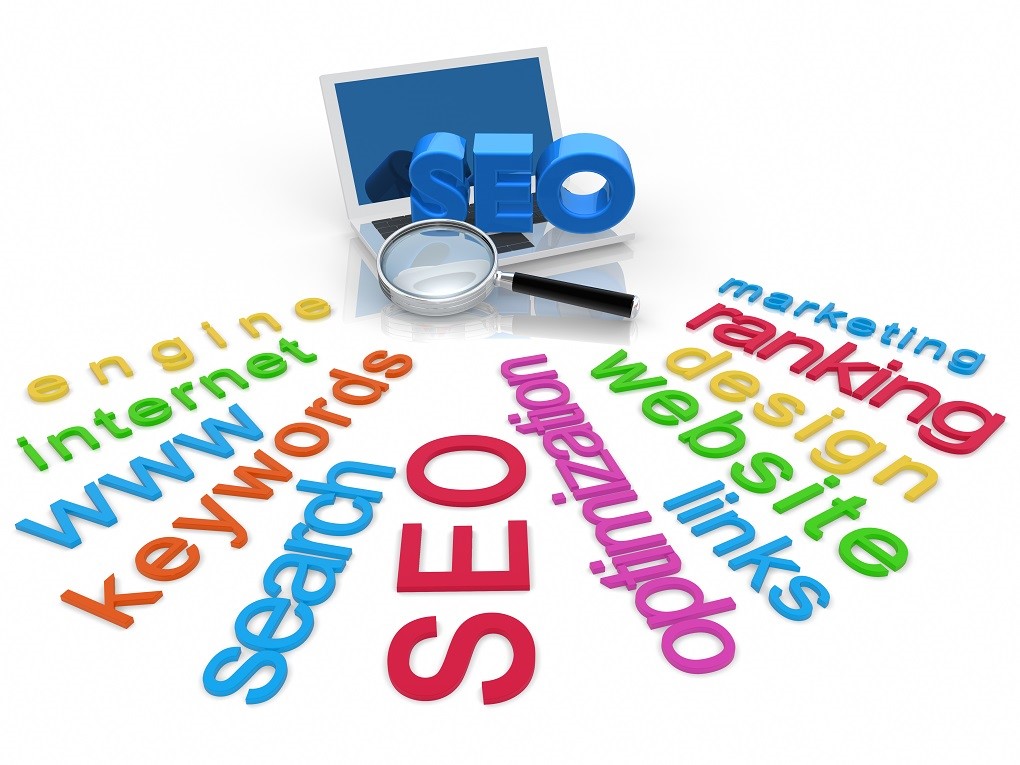
Search engine visibility is extremely important
If your site is not indexed on search engines, you most likely won’t be getting that many visitors. In addition, if search engine bots cannot understand your site, you won’t get ranking, or rank highly. For instance heavy use of JavaScript means that the crawlers won’t be able to interpret a large portion of your site. This means that you won’t be indexed for your key phrases, hence you won’t get traffic, and hence you won’t achieve your goals.
A lot goes into creating a search-engine friendly site, making it an altogether different discussion. However, remember that above appearance, you want your site to be usable for your visitors and accessible for search engines. Together, the three aspects should propel you to the top of your game.
Obviously another alternative to getting visibility is via Social Media. However, if you can have both ways all the better, right?


Comments are closed.