
Do you remember the change from black and white over to rich color as Dorothy steps out of her house into Oz? The crisp, bright colors make an impression on viewers. While the immediate contrast in the film is unforgettable, many online brands do not harvest the potential to make an incredible impression on web browsers.
Colors encompass all matter around us, but marketers understand the psychology associated with colors, using them to impress and motivate consumers. Is your website exacting colors to influence visitor actions? Products and services seek to address problems of consumers, and part of the mission of ad copy is alerting consumers of the solution.
For example, the color red is known for grabbing attention; green, alternatively, relaxes viewers. A vacation destination may leverage both colors in their advertising, first generating initial interest with red then applying hues of green to emulate the relaxation felt while on vacation. It’s a mild leverage of color and psychology, yet markets and brands enjoy the fruits of expected reaction.
Brand Recognition
 Branding involves associations to a company, encompassing slogans, personalities, and colors. Are you effectively leveraging colors as part of your branding process? Consider the psychology related to particular hues.
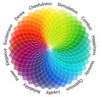
For example, the color red is associated to boldness, excitement, and heat, a great color for nightclubs, extreme sports brands, and brands that want to be known for making progressive or bold implementations. Conversely, cooler colors, such as light blues, are associated with tranquility and calmness. A lounge chair company, channeling feelings of calmness and relaxation, may use light blue effectively. These colors would be implemented in your logo, maybe even on your Custom Boxes Now containers for branding purposes.
Imagine a king, wearing his royal robe. Do you see purple? Purple is regularly associated with authority, sophistication, and royalty. A number of brands, interested in creating associations of prestige, implement purple into their brand logos and websites.
Where on your individual brand pages could you implement color to help facilitate an intended or encouraged mood?
Varied Media
What varieties of media are you providing to your brand’s customers? Depending on their journey through the sales cycle, you may want to induce different feelings and associations. For example, as in the intro, a contrast of feelings is used to ultimately entice a consumer to make a purchase, introducing a palatable issue and offering the brand product/service as the solution.
Let’s assume a landing or ad page leverages a kitchen renovation service. Do you want to invoke feelings of jealousy or envy? Perhaps the renovation service could implement the color yellow, showing the viewer a picture of those ‘who have’ vs the ‘have nots’ viewing the ad. Furthermore, since green inspires associations with good taste. Another page, further down the sales cycle and infused with that color, may refer to the intended consumer’s future spoils of good test, symbolized by their new kitchen renovation.
Logo
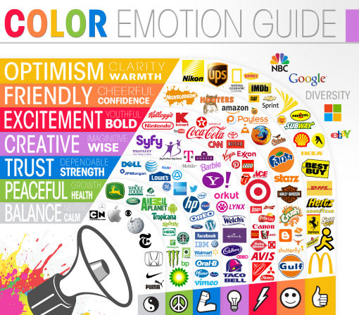
A company’s logo is its face, how we immediately recognize a business, like we would a friend or associate. While geometric shapes also influence perception, marketers purposely infuse logos with particular colors, facilitating associations with each interaction.
As mentioned above, the color red is associated with boldness and intensity, often found in logos of martial arts studios, training facilities, and professional teams. (Cincinnati’s baseball team, the ‘Reds,’ serving as an example). While, text is used to communicate to consumers via taglines and slogans, the textual entities may be enforced and encouraged through color implementation. In some cases, such as women clothing brand, Victoria’s Secret, brands reverse the associative structure, urging consumers to ‘think Pink,’ a color associated with sophistication and sincerity.
Consistency and Ambiguity
Colors and elicited psychological associations are not a simple science, nor does simply implementing a color demand a direct response. In addition, one may identify conflicts or antithetical implications; for example, though red is identified with intensity and sports, the St. Louis Blues, a national hockey team, host a name normally associated with pacific emotions.
More than one-time implementations, marketers and brands work at delivering consistency, helping to bridge the gap between contrasting emotions and similar colors. Branding is a continuous process; therefore, web masters are encouraged to implement consistency throughout web pages and brand property.
Are you leveraging colors throughout your site consistently? Moreover, are you accounting for your exact target market and not the general population? As you’ll read next, different cultures develop varying associations.
International Business
If you belched at your mother-in-law’s kitchen table, you may be labeled rude. However, in other cultures around the world, burping is considered a compliment to the chef and the host serving the food. While particular color psychology applies in a general sense, such as red equating to love, marketers and web masters must account for individual context.
While colors help brands produce consistent messages and reactions, businesses must account for different geographic areas and cultures. For example, a study conducted using peoples of China and Britain produced dissimilar results according to reactions of color swatches.
Each participant was shown 20 different color swatches, with elicited feelings and reactions noted. The Chinese participants reported choosing colors they self-rated as associating feelings of cleanliness, freshness, and modernity, but British participants showed less affection for colors as well as feeling varied immediate emotions than the Chinese.
Furthermore, in America, being ‘yellow’ is oft associated with cowardice, but in Africa, tribes often implement the color as a sign of victory. Is your brand international? Are you producing the same affects with your chosen colors? Furthermore, ensure your target market does not associated particular colors to things they dislike. For example, the Philadelphia Eagles’ uniforms brandish the color green. While green may produce positive associations in Philadelphia, the color blue may not be so well liked, being the color associated to the Eagles’ tri-state area rival, the New York Giants.
Conclusion
When evaluating purchase intent, marketers urge brands to think about target markets first, and then leveraging colors. For example, as noted above, Pink is associated with sincerity and sophistication, but it’s highly unlikely a male lawyer would make his practice’s logo pink. Of course, we would assume every business would like to be associated with elements of sincerity and sophistication, yet it’s unlikely a male would choose a color generally associated with femininity.
image credit: thelogocompany.net
Related Posts
![Depositphotos: High-quality Stock Files, Vector images and Videos [giveaway]](https://www.iblogzone.com/wp-content/uploads/2013/07/depositphotos-vector-collection-150x150.jpg) Depositphotos: High-quality Stock Files, Vector images and Videos [giveaway]
Depositphotos: High-quality Stock Files, Vector images and Videos [giveaway] Visual Marketing Online: 3 Social Media Platforms You Should Be Utilising
 OMG, My Traffic Is Down. Did I Got Hit By Penguin 2.0? Not Necessarily…
![[HOW TO] Drive Targeted Traffic to your Website With Instagram](https://www.iblogzone.com/wp-content/uploads/2013/07/light-colors-spa-150x150.jpg) [HOW TO] Drive Targeted Traffic to your Website With Instagram
[HOW TO] Drive Targeted Traffic to your Website With Instagram How To Write Attention Grabbing Blog Posts
 Top Searches 2014, Google Panda Leaked Dos & Don´ts, SEO Powersuite Giveaway, Speedlink 49:2014
 E-commerce Trends Worth Looking At and Follow in 2017
 Google Webmaster Tools: Advanced Features to Improve a Site’s Ranking and Performance
Comments are closed.