Google controls how many people find your site. Website user interface design determines how visitors react to your website. From a business owners’/marketers’ perspective, you’d typically want your readers to take action?
Build up with content and lead them to the precious box with the single call-to-action. Or place the opt-in box, “buy now” button or “subscribe button” above the fold while copy flows down to the rest of the page.
What exactly happens on the website though? What do visitors do when they come calling? How does your UX/UI (user interface/user experience) design affect SEO? Why is user interface design linked to SEO success in 2013 and beyond?
Let’s find out:
SEO is the channel; UX/UI create first impressions
Bold businesses experiment with their UX/UI as they have control over the look and utility of websites. SEO depends on leading search engine algorithms and thereby businesses take a “follower” role when it comes to optimizing websites for search. Both of these practices come together when the road (SEO) leads to the destination (UX/UI): to land at a web page is one thing (marketing); what happens at the page itself is something else (conversions).
Google’s Penguin and Panda updates are now systematically weeding out sites that don’t meet basic standards related to content, design (UX/UI), utility, relevance and speed.
Today, and for the time to come, SEO and UX/UI are more like inseparable sisters that businesses will learn to treat with respect since one won’t work without the other.
Graphical text is an SEO trap
Graphics grooms your website and makes it look stunning. There are practical and reasonable legitimate reasons to use graphical text on your website. Most websites, however, use large blocks of text as images. While it still looks good and can help you grab your visitors’ attention, the search engine bots will have no clue.
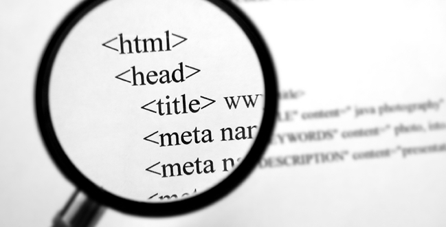
For instance, if you had to look at the possible source code for a single-page website (a landing page?) with just a large graphic which is actually text rendered as an image, it’d look like this:
<HTML>
<head>
<title> The Juicy red Carrot: Your Attention Grabbing Headline </title>
</head>
<body>
<ahref = “somerandomlink.com””><imgsrc = “images\examplegraphic.png”></a>
</body>
</HTML>
This still works great for user interface but doesn’t do a thing for SEO. If, however, you do the following, the game changes:
<HTML>
<head>
<title> The Juicy red Carrot: Your Attention Grabbing Headline </title>
</head>
<body>
<ahref = “visuallyappealingseo.com””><img alt = “SEO consulting company with emphasis on UX/UI while making SEO work. Download Free SEO resources. Read our blog on SEO best practices, Using UX/UI with SEO, 1-on-1 SEO consulting, SEO for small businesses, and much more. Come Visit Us In San Jose, California. ” “Images\SEOwithUXUI.png”></a>
</body>
</HTML>
Note that we use a link (domain name) that has a part of the keyword, “alt text” for the image (which works just as well as meta information for blog posts or web pages), and we even qualify the name of the image file.
Using graphics and images is a great idea. Using these simple inclusions such as “IMG alt” tags, Meta information, and other tactics such as SEO friendly URLs helps avail SEO benefits.
Where is the fold?
Head over to NY Times website and you’ll see the logo, the headline, sub-heading, and the content – it looks like the way a newspaper should look like. It’s the traditional “above the fold” approach. Remarkably, Paddy Donnelly, a UX designer, came up with another radical and bold concept, which spits on tradition’s face: “below the fold”.
He points out that while “above the fold” concept came from newspapers and was later adopted as a default design trend for websites, it makes almost all websites look the “same”. He proves a point with his website that people have learnt to scroll and there’s no need to cram everything you have above the fold wasting all the space below it.
So, what’s SEO got to do with the fold? Once you take Paddy’s approach to design and layout, you make plenty of space available for content while not jostling for the apparently premium “above fold” area.
Push a lot more content on your home page layout, have more space to play around with, and you can do a lot more with your UX/UI interface while doing justice to your SEO efforts.
Pretty scripts can kill SEO: Find the sweet spot
Modern website design is not complete without Javascripts, jQuery, Ajax, and dynamic widgets (such as flash files, Java applets, and Active X controls). There’s a strong reason why website design isn’t complete without these technologies: websites derive great functionality, interactivity, and host many practical applications.
As for SEO, these scripts play spoilsport. According to John I. Jerkovic who authored the book SEO Warrior,
“…Stay away from Ajax if you want to allow search engines to properly index your website. Nonetheless, Ajax is a very attractive way to improve the web user experience. However, be selective in terms of where you employ it”.
Other problems such as extremely large pages, complicated code using, external DIVs, slow loading pages (here’s a suggested solution for WordPress), web server compression, caching, error pages can all cause SEO blocks, which you’ll want to remove.
Use scripts, but get choosy about them. Find the sweet spot for optimum use of scripts for making your website more interactive and to give it a great UX/UI interface. Simply put, embed all scripts in HTML.
SEO + UX/UI is team work, and it’s a defining trend in SEO
 Usabilitygeek.com offers a helpful post with official guidelines on web user Interface with web design, which you might want to stack up as reference. Since you’ll be working with web design with SEO in focus, check out Michael Evans’ post on 7 HTML Guidelines for Website Usability and SEO.
David K. Williams contributes to Forbes.com. His post on What Will Your SEO Look Like in 2013? (The Experts Weigh in) alludes to Rand Fishkin on SEOmoz.org who has a great point to make:
“Whether you get to have direct impact or whether it’s indirect impact and you have to work with other people across teams, those should be the things on your list. If UI/UX is holding back the achievement of the marketing goals and the search rankings that can help get you there, then you need to work on that. Same story with speed. Same story with accessibility or responsive design, with content strategy, with branding, with press and PR, public relations.”
Great content, increased attention to SEO aspects of your website, and an equal emphasis on user interface design are all critical aspects of making your website for your business.
Is your website on the right side of SEO with effective UX/UI design?
image credit (UX): hubzdesign.com


![WebMeUp All-In-One SEO – Blogging Contest $4.000+ Prizes [Over]](https://www.iblogzone.com/wp-content/plugins/related-posts-by-zemanta/static/thumbs/13.jpg)

Comments are closed.